Why Natural Light Should Be Your First Consideration When Choosing Upholstery Fabric
Choosing upholstery fabric based on color swatches alone is one of the most common mistakes homeowners make. That gorgeous dusty blue chenille you fell in love with online might look completely different once it's on your sofa in your actual living room — because natural light is the single biggest variable in how upholstery fabric looks and performs in a space. This spring, if you're planning a refresh, understanding how light direction affects your fabric choices will save you from expensive regrets.
Every room in your home receives light differently depending on which direction its windows face. North-facing rooms are cool and consistent. South-facing rooms are bright and intense. East-facing rooms get warm morning sun, and west-facing rooms get that punchy late-afternoon glow. Each of those conditions changes how a fabric's color reads, how quickly it fades, and which fiber types are actually worth the investment.
Here's the thing: spring sunlight sits at a lower angle than summer sun, which means it travels deeper into your rooms than you might expect. A sofa that sat comfortably in indirect light all winter could suddenly be getting a few hours of direct exposure starting in March. That matters for fading, especially on darker or saturated colors.
North-Facing Rooms: How to Keep Colors from Looking Flat
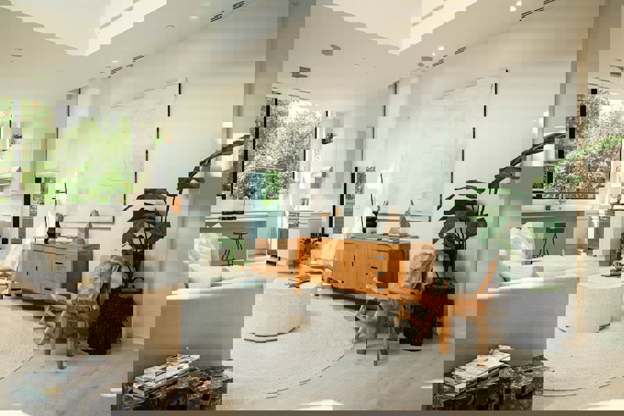
North-facing rooms receive no direct sunlight at any point during the day. The light is cool, consistent, and slightly blue-toned — which is great for artwork and reading, but it can make certain fabric colors look muted, grey, or just a little sad. Fabrics that look warm and inviting in the store can read as cold and flat once they're installed in a north-facing space.
The upside is that fading is almost a non-issue in north-facing rooms. UV exposure is minimal, so you have a lot more freedom with fabric types that might be vulnerable to sun damage in other rooms.
For north-facing spaces, the best approach is to choose fabrics that bring warmth and visual texture into the room rather than fighting the cool light:
- Velvet: Velvet gets a bad rap for being fussy, but it's genuinely one of the best fabrics for low-light rooms. Its cut pile reflects light beautifully, creating depth and richness that glows even without direct sun. A warm-toned velvet in mustard, terracotta, or deep teal will feel alive in a north-facing room.
- Chenille: Honestly, chenille is criminally underrated. Its textured pile catches ambient light in a way flat-woven fabrics simply can't, making it ideal for rooms that need a warmth boost. It's also soft, durable (many chenille fabrics reach 30,000 double rubs or more, meaning the fabric surface can withstand significant friction before showing wear), and typically easy to clean.
- Boucle: The looped texture of boucle creates visual interest without relying on color saturation. It tends to look intentional and cozy in north-facing spaces rather than washed out.
- Warm colors: Cream, warm beige, ochre, rust, and earthy oranges read much better under cool north light than cool greys or icy blues.
Avoid fabrics with cool undertones in these rooms. A cool grey linen might be your dream fabric, but in a north-facing living room, it can look almost institutional. If grey is your goal, go warm-toned and pair it with texture.
South-Facing Rooms: What Fabrics Can Actually Handle Intense Sun Exposure?
South-facing rooms receive the most direct sunlight of any orientation — often six or more hours of sun per day in spring and summer. That light is warm, bright, and flattering to almost any color, but it comes with a significant trade-off: UV radiation accelerates fabric fading faster than almost any other factor in a home environment.
Solution-dyed acrylic fabrics are widely considered the gold standard for sun-exposed spaces. In solution-dyed construction, pigment is added to the fiber itself before it's spun into yarn, rather than applied to the surface afterward. This means the color goes all the way through the fiber and is dramatically more resistant to fading than surface-dyed alternatives. Many solution-dyed acrylic fabrics are rated to resist fading for 1,000 to 2,000 hours of direct UV exposure without significant color loss.
For south-facing rooms, prioritize:
- Solution-dyed acrylic or performance fabrics: These are built specifically for high UV environments. They're also typically stain-resistant and easy to clean, which makes them a strong choice for busy households.
- Linen: Natural linen fades gracefully and its slightly textured surface doesn't show early-stage fading as harshly as flat, saturated fabrics. A bleached or natural linen actually gets better-looking as it ages in sunlight.
- Cotton with tight weaves: Tighter weave structures slow UV penetration into the fiber, giving the fabric more resistance than loosely woven alternatives.
- Light to mid-toned colors: Very dark colors and very saturated colors (especially bright red, navy, and deep green) show fading the most visibly. Lighter tones like cream, warm white, soft blue, and sage green are more forgiving over time.
Avoid velvet in south-facing rooms if possible. Velvet's cut pile makes faded patches especially visible because the direction of the pile affects how light reflects off worn areas. A faded velvet sofa in a sunny room is one of those things you can't unsee once you notice it.
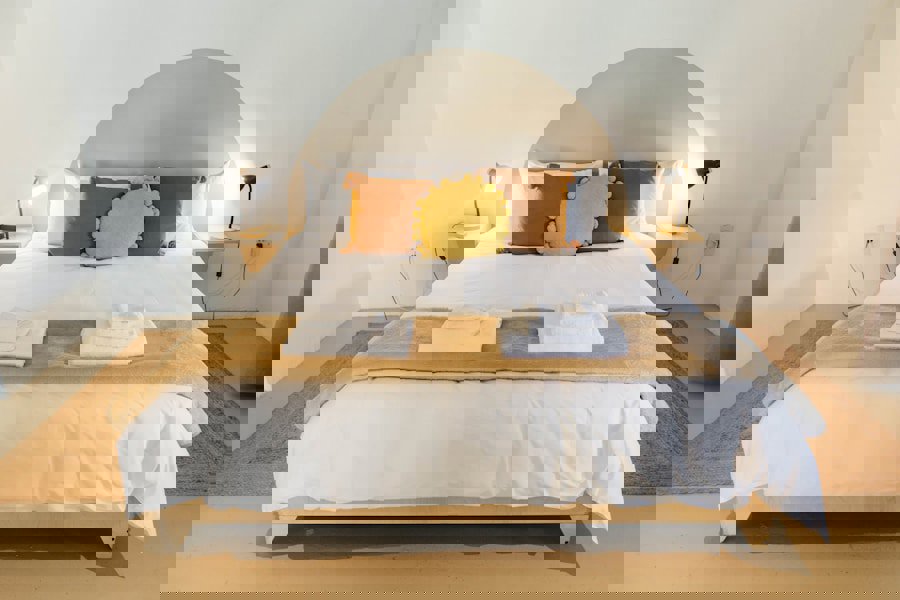
Photo by Vije Vijendranath on Unsplash
East and West-Facing Rooms: Managing Directional and Shifting Light
East-facing rooms get direct morning sun, typically from sunrise until late morning. The light is warm, golden, and relatively gentle compared to south-facing exposure. West-facing rooms get the opposite: afternoon and early evening sun that can be intense, low-angled, and particularly harsh in late spring and summer. Both orientations involve periods of direct sun followed by indirect or no sunlight, which creates different challenges than a room with consistent exposure.
The directional nature of east and west light means that one side of a sofa or chair might receive significantly more UV exposure than the other. Over time, this can cause uneven fading, which is often more visually jarring than overall fading. A sofa where one arm is noticeably lighter than the other is a tough problem to fix without reupholstering.
Here's how to approach fabric selection for these orientations:
- East-facing rooms: Morning light is generally the gentlest direct sun. You have fairly broad flexibility with fabric type, but still avoid very dark saturated colors on pieces that sit directly in the sun's path. Jacquard weaves and woven textures work well here because their dimensional surface patterns hold up visually even if minor fading occurs.
- West-facing rooms: Treat these similarly to south-facing rooms in terms of fading resistance. The afternoon sun can be brutal, especially in spring and summer when it stays low and direct for several hours. Performance fabrics and solution-dyed options are worth the investment.
- Striped or patterned fabrics: Patterns are a smart choice for east and west exposures because they disguise uneven fading far better than solid colors. A solid navy chair in a west-facing room will eventually show a bleached patch where the sun hits. A multi-toned stripe on the same chair will absorb that change without looking damaged.
Rotating cushions regularly is one of the easiest ways to slow uneven fading in east and west-facing rooms. It takes two minutes and can extend the life of your fabric significantly.
Choosing Fabric Color and Texture for Spring Light Across Every Room
Spring is genuinely one of the best times to reassess your upholstery because the seasonal light shift reveals how your current pieces are performing. You'll notice fading that was hidden in low winter light. You'll see which colors feel fresh and alive under the longer days, and which ones feel stale.
A few universal principles worth keeping in mind as you shop:
- Always test samples in your actual room. Order fabric swatches and live with them for a few days in the spot where the piece will actually sit. Look at them in the morning, afternoon, and under artificial evening light.
- Double rub count matters for high-traffic pieces. Double rub count measures how many times a fabric can be rubbed back and forth before it shows wear. For sofas and dining chairs, look for a minimum of 15,000 double rubs. For heavy family use with kids or pets, 30,000 or higher is the better benchmark.
- Fiber type affects color consistency over time. Synthetic fibers like polyester and acrylic hold color better under UV exposure than natural fibers like cotton or linen. If you love natural fibers for feel and aesthetics, balance that with realistic expectations about fading in sunny rooms.
- Weave structure affects light reflection. Flat, shiny weaves (like some jacquards and velvets) show fading and wear more visibly than textured, matte surfaces. Textured weaves scatter light and disguise minor wear.
Spring trends this year are leaning into warm, earthy tones and organic textures. Soft terracotta, sage green, warm cream, and textured weaves are everywhere right now. Those colors also happen to play beautifully in almost any light condition, which makes this particular trend cycle very practical for anyone doing a spring upholstery refresh.
Frequently Asked Questions
Q: Which upholstery fabrics are most resistant to fading from sunlight?Solution-dyed acrylic fabrics offer the strongest fade resistance because the color is embedded in the fiber itself rather than applied to the surface. They're widely used in outdoor and high-sun applications and can resist fading for 1,000 to 2,000 hours of direct UV exposure. For indoor use in sunny rooms, performance-grade polyester and tightly woven cotton blends are also strong options.
Q: How does a north-facing room affect how fabric colors look?North-facing rooms receive cool, indirect light all day with no direct sun. This light has a slightly blue tone that can make warm colors look muted and cool colors appear flat or grey. To counteract this, choose fabrics with warm undertones, rich textures like velvet or chenille, and colors in the earthy, amber, or deep jewel-tone range that hold their visual warmth under cool ambient light.
Q: What is a double rub count and why does it matter for upholstery fabric?Double rub count measures how many back-and-forth friction cycles a fabric can withstand before showing visible wear. It's the standard durability rating used across the upholstery industry. For everyday residential use on sofas and chairs, look for a minimum of 15,000 double rubs. For homes with children, pets, or heavy daily use, fabrics rated at 30,000 double rubs or higher will hold up significantly better over time.