
You've finally decided to refresh your sofa, accent chair, or those dining room seats that have been looking tired since 2019. You find a fabric you love online, order a yard, hold it up in your living room, and something feels off. It's not ugly exactly. It just doesn't fit. That's almost always an undertone problem. This guide walks you through how to identify whether your home's existing colors run warm or cool, and how to choose spring upholstery fabrics that genuinely harmonize with what you've already got.
Step-by-Step Instructions
- Start with your walls, not your furniture. Your wall color is usually the most dominant fixed element in a room, so it's the right starting point. Stand in the room during daylight, ideally in the morning or early afternoon when natural light is most neutral. Look at your wall color and ask: does it feel creamy, peachy, or golden? Or does it feel icy, bluish, or grayish? Creamy and golden tones are warm. Icy and grayish tones are cool. If you painted with a specific paint brand, you can often look up the undertone on the manufacturer's website. Benjamin Moore and Sherwin-Williams both list undertone information on their color detail pages.
- Read your flooring next. Hardwood floors are one of the biggest giveaways. Red oak has pink and orange undertones, which are warm. White oak and maple read more neutral to slightly cool. Walnut sits on the warmer side with rich brown tones. If you have tile or stone, gray and blue-toned stone is cool, while beige or tan stone is warm. Laminate and LVP often have a printed wood grain, so look at the dominant color: does it lean toward honey and amber, or toward ash and slate?
- Check your fixed textiles and accessories. Rugs, curtains, and throw pillows you're not planning to replace are part of your undertone story too. A navy rug with blue undertones is cool. A burgundy or rust-toned rug is warm. If your accessories are a mix, don't panic. Look for the majority. Most rooms lean one way even if they have a few outliers.
- Determine your room's overall undertone category. By now you've looked at your walls, floor, and accessories. Write down what you noticed. If two out of three lean warm, your room is warm-toned. If two out of three lean cool, it's cool-toned. A genuine 50/50 split means you have a neutral room, which is actually the most flexible situation you can be in. Neutral rooms can pull from either warm or cool fabrics without things going sideways.
- Match spring fabric colors to your undertone profile. Here's where it gets fun. Spring 2025 is leaning heavily into earthy organic tones, soft botanicals, and what designers are calling "quiet luxury," which basically means elevated neutrals that don't shout. For warm-toned rooms, look at fabrics in terracotta, warm sage, golden yellow, caramel, and rust. These all carry yellow or red undertones that will feel at home alongside warm floors and creamy walls. For cool-toned rooms, reach for dusty blue, lavender, soft teal, cool gray, and crisp white. These carry blue or purple undertones that settle naturally into cooler spaces. Neutral rooms? Honest answer: you can try almost anything, but warm greige, soft blush, and natural linen tend to be the most universally flattering choices.
- Pull fabric swatches before committing to yardage. Always order swatches. This is non-negotiable. Colors on screens vary depending on monitor calibration, lighting in the product photo, and about a dozen other things outside anyone's control. At Famcor Fabrics, most fabrics are available by the yard so you can test a small piece in your actual room under your actual lighting before you commit to the full project. Hold the swatch against your wall, lay it on your floor, and put it next to your existing furniture. If it feels right in all three spots, you've found your fabric.
- Factor in fabric type alongside color. Color is the headline, but fabric texture also affects how a color reads in a room. Velvet absorbs light and makes colors look deeper and richer. This is great for jewel tones in a cool-toned room but can make a warm room feel heavier than you want. Linen and woven fabrics reflect more light and make colors feel airier, which is ideal for spring and for warm rooms that are already feeling cozy. Chenille sits in the middle, with a soft texture that's forgiving in both warm and cool palettes. Honestly, chenille is criminally underrated for spring updates.
- Think about durability alongside color. A fabric can be perfect in color and completely wrong for your life. If you have kids or pets, fabric durability matters as much as aesthetics. Double rub count is the standard measurement for upholstery fabric durability. It measures how many times a fabric can be rubbed back and forth before it shows wear. For residential use with moderate traffic, look for a minimum of 15,000 double rubs. For heavy use with kids and pets, 30,000 or higher is a smarter investment. Solution-dyed acrylic fabrics, where the color is baked into the fiber rather than applied on top, offer excellent fade resistance and are easier to clean, which is useful when spring light starts flooding your windows and showing every crumb.
- Consider finish and cleanability for spring living. Spring means open windows, more foot traffic, and in a lot of households, muddy paws and soccer cleats. Performance fabrics treated with stain-resistant finishes are worth the small premium. Look for fabrics with a Martindale abrasion test rating, which is similar to double rub count but used more commonly for European fabrics. A Martindale rating of 20,000 or higher is appropriate for general residential upholstery. For fabrics in high-contact zones like a family room sofa, 40,000 or higher is ideal. Faux leather and vinyl are also worth considering for households where cleaning ease is the top priority. Modern faux leathers have improved dramatically and carry none of the stiffness issues older versions had.
- Commit and order with confidence. Once you've confirmed your undertone category, chosen a color direction that matches, selected a fabric type that suits your lifestyle, and verified it looks right as a swatch in your space, you're ready to order. Calculate your yardage based on the piece you're reupholstering and always add 10 to 15 percent extra to account for pattern matching and cutting errors. If you're working with a patterned fabric like a floral or stripe, add closer to 20 percent.
What Are the Best Upholstery Fabric Colors for Warm-Toned Rooms in Spring?
The best spring upholstery fabric colors for warm-toned rooms are earthy greens, terracotta, golden yellow, caramel, and rust. These share yellow or red undertones that naturally complement warm walls and honey-toned floors without competing.
Warm rooms tend to glow in the right light, and the goal is to lean into that rather than fight it. A warm sage green, for example, has enough yellow in it to feel intentional alongside warm oak floors. A cool mint green in that same room will look like it wandered in from a different house. Fabric texture plays a supporting role here too. Linen and woven fabrics in warm earthy tones are an especially strong choice for spring because their natural fiber look echoes the organic, botanical direction that's trending heavily right now. Jacquard fabrics in botanical or floral patterns that combine warm greens, golds, and terracotta are a way to bring in spring pattern without abandoning your room's warm foundation.
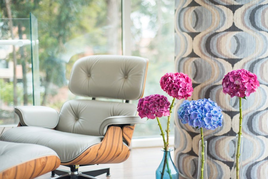
What Upholstery Fabrics Work Best in Cool-Toned Rooms?
Cool-toned rooms are most harmonious with fabrics that carry blue, purple, or gray undertones. Dusty blue, soft teal, lavender, cool gray, and crisp white are reliable spring choices for rooms with icy walls, gray floors, or blue-leaning accessories.
Velvet is a natural fit for cool-toned rooms. Its light-absorbing surface deepens colors beautifully, making a dusty blue velvet sofa feel intentional and luxurious rather than random. Boucle in soft gray or cream is another strong pick for cool spaces. It's having a serious moment in interior design right now and for good reason. The textured loop structure adds visual warmth without introducing warm color undertones, which is exactly what you want when you're trying to keep a cool room feeling polished rather than cold. For a cool-toned room where you want to introduce spring color without disrupting the palette, soft blush is worth considering. Blush with a slight lilac or gray undertone reads as a cool pink, which is very different from peach, which will immediately tip into warm territory.
Photo by Dan LeFebvre on Unsplash
Quick Tips and Troubleshooting
- Your room looks different at night. Always check your fabric swatch under artificial lighting as well as daylight. Incandescent and warm LED bulbs intensify warm undertones. Cool daylight bulbs do the opposite. If your swatch looks great at noon but wrong at 7pm, that's the lighting talking.
- Don't try to match exactly. Matching a fabric color exactly to your wall color flattens a room visually. Aim to harmonize, not twin. A fabric that's a few shades deeper or lighter than your wall in the same undertone family will look far more intentional than a perfect match.
- Pattern direction matters on stripes. Vertical stripes on an upholstered piece make furniture appear taller. Horizontal stripes make it appear wider. This is a quick visual trick if you're trying to adjust the perceived scale of a piece.
- Warm gray is a real category. Gray is often assumed to be cool-toned, but greige and warm gray tones carry yellow or beige undertones and belong firmly in the warm category. If you have a gray room that feels cozy rather than cold, it's likely warm gray, and you should shop accordingly.
- Swatches look different on different surfaces. Hold your swatch against the piece you're planning to reupholster, not just against the wall. The existing color of the furniture frame or any remaining fabric will affect how the new material reads.
Frequently Asked Questions
Q: How do I know if my home has warm or cool undertones?Look at your walls, flooring, and fixed accessories in natural daylight. If they lean toward creamy, golden, peachy, or red-brown tones, your home is warm-toned. If they lean toward icy, gray, blue, or purple tones, it's cool-toned. The majority of what you see determines your overall undertone category.
Q: Can I use warm-toned fabrics in a cool-toned room?You can, but it takes intention. A single warm-toned accent fabric, like a rust-colored throw pillow, can add contrast without disrupting a cool room. Using warm-toned upholstery on a large piece like a sofa in a cool room will create visual tension, which some people love as a design choice and others find unsettling. Order swatches and live with them in your space for a day before deciding.
Q: What is a good double rub count for upholstery fabric in a living room with kids and pets?For a living room with children and pets, look for an upholstery fabric with a double rub count of at least 30,000. Double rub count measures how many back-and-forth abrasion cycles a fabric withstands before showing wear. Higher-traffic family rooms benefit from fabrics rated at 50,000 double rubs or more, especially in areas like sofa seat cushions that take the most daily use.