Why Spring Is the Best Time to Rethink Your Upholstery Fabric Colors
Spring is the season when everyone suddenly notices that their sofa looks a little tired, a little off, or just plain wrong in the light pouring through freshly cleaned windows. Natural daylight is brighter and more honest than any lamp, and it has a way of revealing whether your upholstery fabric colors are actually working in your space. Choosing spring upholstery fabrics that complement your skin tone and your room's existing palette is one of those decisions that sounds complicated but really comes down to a few straightforward principles. Get it right, and your living room feels pulled together without you being able to explain exactly why. Get it wrong, and something just feels off.
Here's the thing: fabric color doesn't exist in a vacuum. It reacts to the light in your room, the other colors around it, and yes, the people sitting on it. If you've ever worn a color that made you look washed out or overly flushed, you already understand this intuitively. The same dynamic plays out with your furniture.
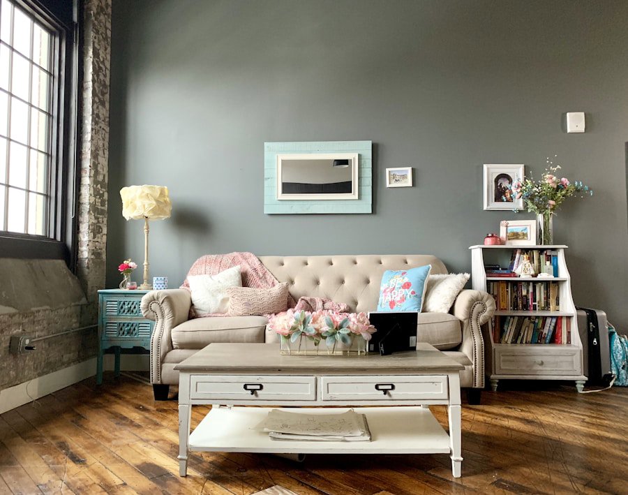
Photo by Sophia Kunkel on Unsplash
Understanding Warm vs. Cool Undertones in Fabric Color Selection
Undertones are the subtle hues beneath a color's surface. A beige fabric can lean warm (golden, peachy, creamy) or cool (pinkish, grayish, almost lavender). The same goes for your skin. Warm undertones tend to show golden, yellow, or olive hints. Cool undertones lean pink, red, or bluish. Neutral undertones sit somewhere in between and have the easiest time with most color families.
Why does this matter for upholstery? Because when you sit in a room surrounded by a fabric color that clashes with your natural undertone, the effect is subtle but real. The wrong warm-toned sofa can make a cool-toned person look slightly sallow or tired by comparison. The right fabric color will make everyone in the room look a little better, almost without knowing why.
For a quick self-check on your undertone, look at the veins on the inside of your wrist in natural light. Green-ish veins suggest warm undertones. Blue or purple-ish veins point toward cool undertones. If you honestly can't tell, you're probably neutral, and most fabric colors will work in your favor.
What Upholstery Fabric Colors Work Best for Warm Undertones?
Warm-toned fabrics create visual harmony with warm undertone skin, making both the room and the people in it look more cohesive and alive. This doesn't mean your room needs to be a sea of amber and rust, but anchoring your main upholstery piece in the warm color family goes a long way.
The best spring upholstery fabric choices for warm undertones include:
- Terracotta and burnt orange: Rich and grounding, these shades have had a strong run in home décor trends and show no signs of slowing down. They pair beautifully with warm-toned wood floors and earthy accessories.
- Golden yellow and mustard: A mustard velvet or chenille accent chair is genuinely one of the more underrated moves in a warm-toned living room. Chenille, for what it's worth, is criminally underrated in general. It's soft, durable, and photographs beautifully.
- Camel, cognac, and warm brown: These neutrals are endlessly versatile and instantly warm up a space. A camel linen sofa in spring feels fresh without being trendy.
- Warm cream and ivory: Not stark white, but that soft, slightly golden cream that feels like morning light. Pair with warm wood tones and greenery for a very spring-appropriate look.
- Olive and sage green: These earthy greens have yellow undertones baked in, which makes them naturally flattering against warm skin tones.
Solution-dyed acrylic fabrics, where color is added to the fiber before it's spun rather than dyed after weaving, hold warm, saturated colors especially well without fading. If you're choosing a rich terracotta or mustard and you want it to stay vibrant through years of afternoon sun, solution-dyed acrylic is a smart specification.
What Upholstery Fabric Colors Work Best for Cool Undertones?
Cool undertones harmonize with fabric colors that carry blue, pink, or grey bases. This doesn't mean your living room needs to feel cold or clinical. Cool-toned palettes done well feel crisp, calm, and genuinely elegant.
The best spring upholstery fabric choices for cool undertones include:
- Dusty blue and slate: Soft, muted blues are universally flattering for cool undertones and happen to be everywhere in spring home décor right now. A blue velvet sofa is a particularly strong choice.
- Lavender and soft purple: These shades sit beautifully in spring palettes and complement cool skin without overwhelming a space.
- Blush and rose pink: Warmer than you'd expect on the undertone scale, blush still reads cool enough to complement cool-toned skin, especially in a bouclé or linen fabric with texture.
- Cool grey and charcoal: Reliable, flexible, and flattering. A grey chenille or jacquard sofa anchors a cool-toned room without committing too hard to any one direction.
- Crisp white and off-white with grey undertones: Where warm whites look creamy, cool whites look clean and bright. The difference is subtle but noticeable side by side.
Velvet gets a bad rap for being high-maintenance, but modern performance velvets are genuinely practical. Many carry a double rub count above 30,000 (double rubs measure how many times a fabric can be rubbed back and forth before showing wear, with 15,000 generally considered the minimum for residential use). A performance velvet in dusty blue or slate is a strong pick for a cool-toned room with kids or pets.

Photo by Evgeniya Shustikova on Unsplash
How to Match Fabric Colors to Your Room's Existing Palette
Your skin tone is one input. Your room is the other. Most living rooms already have a palette whether you planned it or not, defined by your flooring, wall color, trim, and any existing furniture you're keeping. The goal is to find the overlap between what flatters your undertone and what works with the room.
A few practical approaches that actually work:
- Pull from the room, not from scratch. If your floors are warm oak and your walls are a cool greige, you have both warm and cool elements already. Choose a fabric that bridges them rather than doubling down on one.
- Use fabric samples in your actual space. Order swatches and live with them for a few days. Hold them up in morning light, afternoon light, and under your lamps at night. The fabric that looks perfect on a monitor might read completely differently in your room.
- The 60-30-10 rule still works. Sixty percent dominant color (usually walls and floors), thirty percent secondary color (large furniture pieces like the sofa), ten percent accent. Your upholstery fabric sits in that thirty percent zone, so it carries real visual weight.
- Texture changes how color reads. A flat woven fabric in dusty blue looks different from a velvet or a bouclé in the exact same dye lot. Texture adds depth and can soften or intensify a color's effect in the room.
Spring is also a genuinely good time to consider floral or designer print fabrics for accent chairs or ottomans. A floral upholstery fabric with both warm and cool tones embedded in the pattern is a practical way to bridge the two undertone worlds in one piece.
Fabric Types That Perform Well in Spring Living Rooms
Color matters, but so does what the fabric is actually made of. Spring brings more open windows, more foot traffic, and for families, more activity. Here are the fabric types that hold up well while still looking great:
- Linen: Light, breathable, and naturally beautiful in spring palettes. Linen does wrinkle and is better suited to lower-traffic seating unless it's been blended with synthetic fibers for durability.
- Performance chenille: Soft, warm-looking, and surprisingly tough. A good chenille blend can reach 50,000 or more double rubs, making it a solid choice for households with kids or pets.
- Bouclé: A looped-yarn fabric that's been trending hard for a couple of years now and deserves the attention. The texture reads as warm and inviting. Look for a tighter loop construction if you have cats, as the loops can snag.
- Performance velvet: As mentioned, modern performance velvets are far more practical than their reputation suggests. Easy to wipe clean, available in a wide range of colors, and genuinely luxurious underhand.
- Jacquard weaves: Woven-in patterns that don't fade the way printed fabrics can. A jacquard with a subtle botanical or geometric pattern brings visual interest without requiring a bold color commitment.
- Faux leather and vinyl: Extremely practical for high-traffic rooms and very easy to wipe clean. Available in a wider range of colors than you might expect, including warm cognac tones and cool slate greys.
When in doubt, check the Martindale abrasion rating (the European equivalent of the double rub test) or the double rub count on any fabric you're seriously considering. For everyday residential use with kids or pets, aim for at least 25,000 to 30,000 double rubs.
Frequently Asked Questions
Q: What upholstery fabric colors work best for warm skin undertones in a living room?Warm undertone skin tones are most complemented by upholstery colors with golden, earthy, or yellow-based hues. Terracotta, camel, warm cream, mustard yellow, and olive green are all strong choices. These colors share the same warm base as your skin's undertone, creating a visual harmony that makes both the room and the people in it look more cohesive.
Q: Is velvet a practical upholstery fabric for families with kids or pets?Modern performance velvets are much more practical than traditional velvet. Many performance velvet fabrics carry double rub counts above 30,000, which exceeds the 15,000 minimum recommended for residential use. They're also generally easy to spot clean, making them a realistic option for busy households that still want a polished look.
Q: How do I know which undertone my existing room palette has?Look at your flooring, wall color, and largest furniture pieces. Warm rooms tend to have golden, honey, or reddish-brown tones in the wood, walls, or textiles. Cool rooms lean toward grey, white, or blue-grey tones. If your room has a mix of both, choose an upholstery fabric that carries a neutral or bridging tone, like warm grey, soft sage, or a floral print that incorporates both warm and cool colors.