
Why Your Wood Tones Should Drive Your Fabric Choice
Choosing spring upholstery fabrics is a lot easier when you stop looking at fabric swatches in isolation and start looking at them next to your actual furniture. The wood tones and finishes already in your room are doing a lot of visual work, and your fabric either supports that or fights it. Getting this right is the difference between a room that looks pulled-together and one that just feels a little off, even when everything is technically fine.
Wood tones fall into two camps: warm and cool. Warm woods have red, orange, honey, or yellow undertones. Think cherry, mahogany, golden oak, and most pine. Cool woods lean toward gray, ash, or taupe undertones. Think whitewashed oak, driftwood finishes, walnut with gray staining, and most Scandinavian-style pieces. Some woods, like natural walnut, sit right in the middle with a rich chocolate brown that reads almost neutral.
Once you know which camp your furniture lives in, fabric selection becomes much more intuitive. The goal this spring isn't to match everything perfectly. It's to make sure nothing clashes, and that the overall feeling of the room is cohesive.
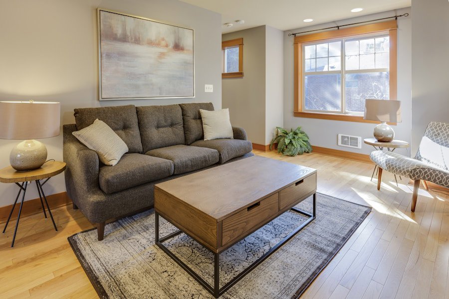
Photo by Francesca Tosolini on Unsplash
What Fabrics Work Best With Warm Wood Tones?
Warm wood tones are flattered by fabrics that share or complement their underlying warmth. That doesn't mean you have to go full autumn harvest, though. Spring is actually a great time to use warm woods as a grounding element while bringing in fresher, lighter colors on top.
Here are fabrics and colors that work well with warm-toned woods like cherry, honey oak, and mahogany:
- Cream and warm white: These soften the intensity of darker warm woods without creating a jarring contrast. A cream linen or cotton blend on a cherry wood frame feels effortless and fresh for spring.
- Terracotta, rust, and burnt orange: These deepen the connection to the wood's red undertones in a way that feels intentional rather than matchy. A terracotta velvet on a mahogany sofa frame is genuinely stunning.
- Warm greens like olive or sage: Green is one of the best complementary colors for warm wood. It pulls from nature in a way that feels seasonal and grounded. A sage chenille or an olive woven fabric brings a spring freshness without abandoning the warmth already in the room.
- Camel, tan, and warm beige: These play directly into the wood's palette and create a tonal, layered look. Suede or faux leather in camel tones is especially good here.
- Muted golds and warm yellows: A jacquard or woven fabric with warm gold threading catches the warmth of the wood and adds texture at the same time.
Chenille, honestly, is criminally underrated for warm wood interiors. The fiber structure catches light in a way that emphasizes warmth, and it has a double rub count (that's a measure of fabric durability, essentially how many times a fabric can be rubbed back and forth before it shows wear) that typically starts around 15,000 and can go well above 30,000. For a family room with busy traffic, that matters.
One thing to avoid with warm woods: stark, cool grays and icy blues. They don't fight with warm wood so much as they ignore it entirely, and the room ends up feeling disconnected.
What Fabrics Work Best With Cool Wood Tones?
Cool wood tones give you a lot of flexibility because they naturally sit closer to neutral. A whitewashed oak coffee table or a gray-stained shelving unit won't battle your fabric choices the way a bright cherry wood might. Still, the wrong fabric can make a cool-toned room feel cold rather than calm.
Here's what works well with cool-toned woods like ash, whitewashed oak, and gray-washed finishes:
- Soft blues and dusty blue-greens: Cool blues feel completely at home with gray and ash-toned wood. A dusty blue linen or a slate blue velvet adds color without disrupting the cool, airy feeling. These are some of the most popular spring upholstery colors right now, and they earn it.
- True greens and teal: These bring life to a cool-toned room without pushing it warm. A teal boucle accent chair next to a whitewashed oak side table is a combination that's showing up a lot in current spring interior trends.
- Soft pink and blush: Blush works surprisingly well with cool gray wood. It adds warmth without overpowering the neutral palette. A blush velvet or a pink floral linen reads as intentionally fresh for spring.
- Charcoal and deep gray: For a tonal, modern look, a deep gray woven or a charcoal faux leather keeps everything feeling cohesive and contemporary.
- White and near-white: Clean whites work beautifully with light, cool woods. A crisp white cotton or an off-white boucle on a Scandinavian-style wood frame feels clean and current.
Boucle is having a real moment right now, and it's particularly well-suited to cool-toned, modern interiors. The looped fiber structure adds tactile warmth even when the color reads cool, which is a useful balance in rooms that lean toward minimalism. Boucle typically performs well in lower-traffic areas, so pair it thoughtfully if you have kids or pets who treat the sofa like a jungle gym.
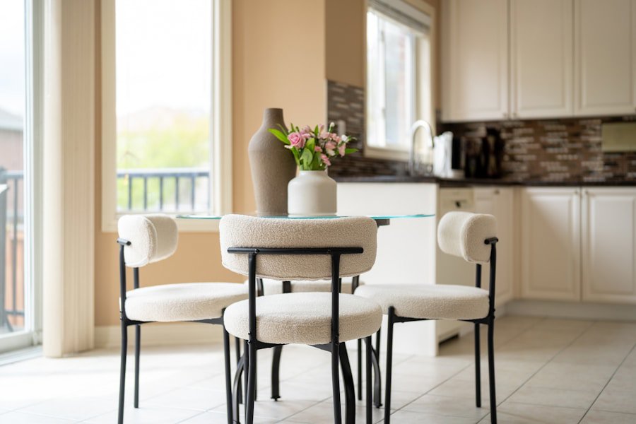
Photo by Franco Debartolo on Unsplash
How to Handle Medium or Mixed Wood Tones in the Same Room
Most real homes don't have one consistent wood tone throughout. You might have a warm oak dining table, a walnut-finished media console, and painted trim in a slightly warm white. That's normal. The goal here isn't to force everything into one lane. It's to find a fabric anchor that can bridge the tones.
Walnut is actually one of the most versatile wood tones to work with. Its rich, dark brown reads almost neutral and accepts both warm and cool fabrics comfortably. A warm green velvet and a cool dusty blue linen can both look right at home next to the same walnut sofa frame, which is why walnut-finished furniture is everywhere right now.
For mixed-tone rooms, focus on fabric colors with medium saturation rather than extremes. Fabrics that are very bright or very dark tend to emphasize the inconsistency in the wood tones around them. A medium-value sage green, a warm taupe chenille, or a soft multi-color stripe that pulls from both warm and cool hues can quietly tie the room together without calling attention to the mix.
Multi-color or designer print fabrics can be genuinely useful in mixed-tone rooms. A floral or stripe that contains both warm and cool tones acts as a bridge, giving the eye a reason to move around the room instead of getting stuck on mismatches.
Fabric Texture and Wood Grain: A Detail Worth Getting Right
Color gets most of the attention, but texture matters just as much as color when you're pairing fabric with wood. Wood has a natural grain pattern that gives it visual texture, and the fabric you choose either adds to that texture story or flattens it.
Heavily grained woods like oak benefit from fabrics with their own texture: chenille, boucle, woven jacquard, or a chunky linen. The two textures balance each other and the room feels layered without being cluttered.
Smoother, more refined wood finishes, like a lacquered cherry or a painted hardwood, look good with fabrics that have a cleaner surface. Velvet, cotton, faux leather, or suede in solid colors complement a refined finish without competing with it.
Velvet gets a bad rap for being high-maintenance, but modern upholstery velvet is much more practical than its reputation suggests. A solution-dyed velvet, where the color is introduced during fiber production rather than applied to the surface afterward, offers excellent fade resistance and easier cleaning. Many upholstery velvets now have a Martindale abrasion rating (a European durability standard similar to double rub count) of 25,000 cycles or higher, which is appropriate for normal household use.
Spring Color Trends to Layer Into Your Wood-Tone Plan
Spring 2025 interiors are leaning into a few specific directions that translate well to upholstery choices. Earthy, muted tones are still strong. Warm terracotta, olive, clay, and dusty rose are all performing well in living rooms right now, and they work with a wide range of wood tones.
Soft greens are everywhere this spring, from pale mint to deep forest, and they're one of the few colors that genuinely flatters both warm and cool wood tones depending on the specific shade. A warm sage reads naturally next to honey oak. A cooler eucalyptus or seafoam reads well against whitewashed or gray-toned wood.
Blue is also having a strong spring season. Dusty blue and slate in particular feel fresh without being trendy in an aggressive way. They're safe long-term investments for a sofa or accent chair because they don't date quickly.
If you're working on a budget and want one category that covers a lot of ground: solid fabrics in medium-value, muted tones are your best bet. They're the most forgiving when coordinating with mixed wood tones, they're widely available, and they tend to have the most consistent durability options across price points.
Frequently Asked Questions
Q: What upholstery fabric colors work best with warm wood tones like oak or cherry?Warm wood tones like oak and cherry pair well with cream, sage green, olive, camel, terracotta, and warm beige. These colors share or complement the red, orange, and honey undertones in the wood. Avoid stark cool grays and icy blues, which tend to clash by ignoring the warmth already in the room.
Q: Can I use velvet on furniture with wood arms or legs?Yes, velvet works well on furniture with wood frames, especially in rooms with smooth or refined wood finishes. Modern upholstery velvets often carry a Martindale abrasion rating of 25,000 cycles or higher, making them appropriate for normal household use. For high-traffic situations, look for solution-dyed velvet, which resists fading and cleans more easily than surface-dyed options.
Q: What fabric is best for a room with mixed wood tones?In a room with mixed wood tones, choose upholstery in medium-saturation, muted colors rather than extremes. A warm taupe chenille, a soft sage green woven, or a multi-color stripe or floral print that contains both warm and cool hues can bridge different wood finishes without drawing attention to the mix.