Choosing upholstery fabric that works with your existing spring décor is one of those tasks that looks simple until you're standing in your living room holding a fabric swatch, wondering why the color looked completely different at home than it did on your screen. Spring is actually a great time to rethink your furniture because the season naturally pulls rooms toward lighter, fresher palettes. But adding a new sofa, chair, or ottoman to a space that's already decorated means you're not just picking a fabric you love. You're picking a fabric that plays well with everything already in the room. That takes a little more thought, and that's exactly what this guide is for.
Start With Color Undertones, Not Just the Color Itself
Color undertones are the subtle hues hiding beneath the main color of a fabric or paint. A beige fabric might lean warm (yellow or orange undertones) or cool (pink or gray undertones), and if it clashes with the undertone of your wall color or rug, the whole room can feel slightly "off" without anyone being able to say exactly why.
Here's the thing: most decorating frustrations come from ignoring undertones. You pick a cream sofa because the room has cream walls, and then it looks muddy or stark in person. The sofa is cream. The walls are cream. But they're not the same cream.
To avoid this, pull the undertones from your existing room elements before you shop:
- Look at your wall color in natural daylight. Does it read warm (golden, peachy) or cool (bluish, greenish)? Spring light is bright and relatively neutral, which actually makes this easier to assess.
- Check your flooring and rug. Hardwood floors typically carry warm undertones (amber, honey, red). Cool gray tile or a blue-toned rug will pull in the opposite direction.
- Look at your existing textiles. Throw pillows, curtains, and blankets all carry undertones. If most of them lean warm, a cool-toned fabric will create tension instead of harmony.
For spring specifically, rooms tend to shift toward soft greens, warm whites, blush pinks, and airy blues. Fabrics in linen, cotton, or light wovens in those color families tend to feel seasonally right without being costumey about it. If your room already has a lot of warm creams and natural wood, a fabric in soft sage green or warm ivory is going to feel far more cohesive than a stark bright white or a cool blue-gray.
Famcorfabrics.com carries a wide range of options in beige, cream, green, and blue that let you compare undertones side by side before committing.
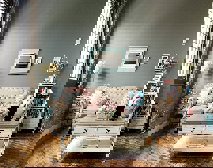
Photo by Sophia Kunkel on Unsplash
What Is Weave Compatibility and Why Does It Matter for Upholstery?
Weave compatibility means selecting a fabric whose texture and construction visually "reads" at the same level of formality or casualness as the other textiles in your room. It's one of the most overlooked parts of fabric selection, and getting it wrong can make a room feel disjointed even when all the colors are technically correct.
Think of it this way. If your room has linen curtains, a jute rug, and wooden furniture with visible grain, that's a casual, organic, natural-fiber story. Dropping a high-sheen velvet sofa into that room creates friction. The velvet isn't wrong on its own. It's just speaking a different visual language than everything around it.
Here's a quick guide to matching weave character to room style:
- Casual, natural rooms: Linen, cotton, woven textures, and boucle all feel at home here. They carry a relaxed, slightly textured surface that aligns with organic décor. Boucle, honestly, is criminally underrated for spring. That loopy texture adds warmth without weight.
- Transitional rooms (the most common): Chenille, jacquard, and soft wovens bridge casual and formal beautifully. Chenille in particular gets better with age and holds up well to daily use.
- More formal or contemporary rooms: Velvet, faux leather, and structured jacquards work here. Velvet gets a bad rap for being high-maintenance, but solution-dyed velvet and performance velvet blends are much more practical than their reputation suggests.
A useful rule: your upholstery fabric doesn't need to match your other textiles, but it should feel like it belongs to the same conversation. Varying textures is good design. Contradicting textures create confusion.
One citable fact worth keeping in mind: fabrics with a tight, flat weave (like many cotton or linen blends) typically have a higher double rub count than loosely woven or looped fabrics. Double rub count is the industry measure of abrasion resistance. One "double rub" is a back-and-forth motion across the fabric surface. Residential upholstery generally needs a minimum of 15,000 double rubs to hold up to normal household use. Fabrics rated above 30,000 double rubs are considered heavy-duty and are a smart choice for homes with kids or pets.
How Does Visual Weight Affect the Way Upholstery Fits a Room?
Visual weight is how heavy or light an object looks, regardless of its actual size. A dark charcoal sofa in a small room feels like it takes up more space than it physically does. A light linen sofa in the same room recedes and breathes. Getting this balance right is especially important in spring, when many people are trying to make their rooms feel lighter and more open.
Visual weight in upholstery fabrics comes from three things: color depth, pattern scale, and surface texture.
- Color depth: Deep, saturated colors (navy, forest green, charcoal, burgundy) carry high visual weight. Soft, muted, or light colors (blush, cream, pale sage, ivory) carry low visual weight. For spring refreshes, leaning toward lower visual weight fabrics in your main upholstery pieces opens the room up.
- Pattern scale: Large-scale designer prints or bold stripes increase visual weight. Small-scale patterns or solids keep things feeling lighter. If your room already has a patterned rug or heavily printed curtains, a solid or subtly textured upholstery fabric will balance things out rather than compete.
- Surface texture: High-pile fabrics like velvet or boucle add visual weight through shadow and depth. Flat-woven fabrics and smooth faux leathers read lighter. This doesn't mean you can't use velvet in a small room. It means you should probably keep it in a lighter color if you do.
The practical approach: look at your room from the doorway before you buy anything. If it already feels heavy (dark walls, dark floors, a lot of furniture), choose an upholstery fabric with low visual weight. If the room feels sparse or a little cold, a fabric with more visual presence will anchor the space.
Photo by Jenny Johannessen on Unsplash
Fabric Types That Work Especially Well for Spring Upholstery Projects
Spring decorating favors fabrics that feel fresh, aren't oppressively heavy, and can handle the realities of daily life. Here are the fabrics worth considering seriously right now:
- Linen: Naturally textured, breathable, and available in every neutral under the sun. Linen upholstery has an effortless quality that works beautifully in spring rooms. It does wrinkle and soil more easily than synthetic blends, so look for linen-blend fabrics with added durability if you have kids or pets.
- Chenille: Soft, durable, and genuinely comfortable to sit on. Chenille fabrics typically perform well in abrasion testing, often hitting 30,000 or more double rubs in quality constructions. The slight sheen and texture make it versatile across casual and transitional rooms.
- Cotton and cotton blends: Cotton is breathable and takes color well, which is why you'll find it in the widest range of spring-appropriate hues. It's also easy to clean when treated or blended with performance fibers.
- Boucle: Having a real moment right now in contemporary interiors, and for good reason. The looped surface adds tactile interest without demanding attention. Looks particularly good in cream, warm white, and soft greiges.
- Performance velvet: If you want color depth and a little luxury, modern performance velvet is far more practical than traditional velvet. Many versions are solution-dyed, meaning the color is locked into the fiber itself rather than sitting on the surface, which dramatically improves fade and stain resistance.
- Faux leather and vinyl: Practical, wipeable, and genuinely improved in quality over the last decade. Great for high-use pieces like dining chairs or kids' room furniture. Not the most "spring" feeling on its own, but in lighter tones like cream, blush, or warm white, it works well.
Browse the full range of options at famcorfabrics.com to compare fabrics by color and type side by side.
Practical Buying Tips Before You Order Fabric Samples
Before you commit to any upholstery fabric, do these things in order:
- Order physical samples. Screen colors are unreliable. Even good product photography can't replicate how a fabric reads under your specific lighting conditions at home.
- Test in the room at different times of day. Fabric that looks perfect in morning light may look completely different under evening artificial light. Spring light is especially variable, so check your sample across at least two lighting conditions.
- Hold the sample next to your existing textiles. Put it next to your rug, your curtains, and any throw pillows that aren't going anywhere. Do they speak the same language? Or does one of them look like it's trying to leave?
- Check the double rub count for your actual use case. For a busy family room sofa, aim for 30,000 or more. For a rarely-used accent chair, 15,000 to 25,000 is fine. Don't pay for heavy-duty performance fabric for a piece that won't see much action.
- Ask about cleanability. Look for "W" (water cleanable), "S" (solvent only), or "WS" (both) cleaning codes on any fabric spec sheet. For homes with kids and pets, W or WS fabrics save a lot of stress.
Frequently Asked Questions
Q: How do I find a fabric that matches my existing décor without seeing it in person?Order physical fabric samples and test them in your actual room before buying. Colors look different on screen than they do in real life, and your specific lighting conditions, flooring, and wall color all affect how a fabric reads. Most upholstery fabric retailers, including famcorfabrics.com, offer samples so you can compare before committing.
Q: What upholstery fabric is best for spring if I have kids and pets?Performance fabrics with a double rub count of 30,000 or higher are the most practical choice for high-traffic homes. Chenille, performance velvet, and solution-dyed fabrics all offer good durability while still looking great. Look for a "W" or "WS" cleaning code, which means the fabric can be cleaned with water, making everyday spills much easier to manage.
Q: Can I mix fabric textures in the same room?Yes, mixing fabric textures is good design practice as long as the textures share a similar level of formality or visual weight. A linen sofa pairs naturally with a boucle accent chair because both carry a casual, organic character. What creates tension is mixing a very formal fabric, like a high-sheen velvet, with very relaxed natural-fiber textiles, unless you're doing it intentionally as a contrast point.