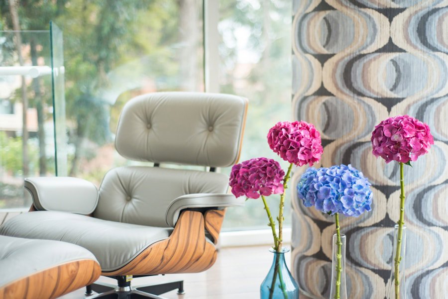
If you've ever reupholstered a chair in a beautiful fabric, then bought a sofa in something completely different, and ended up with a room that looks like it couldn't agree on anything, you're not alone. Layering spring upholstery fabrics across multiple pieces in one room is genuinely one of the trickiest things to pull off, and one of the most satisfying when it works. This post gives you a clear, practical framework for mixing colors, textures, patterns, and proportions so everything feels cohesive without looking like it came from a single factory line. No design degree required.
Step-by-Step Instructions for Layering Spring Upholstery Fabrics
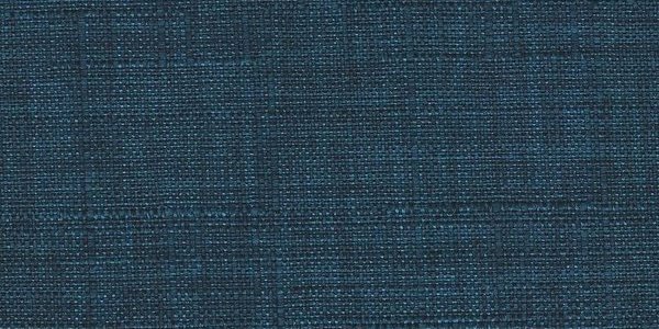
- Start with one anchor fabric and build outward. Pick the most dominant piece in your room, usually the sofa, and choose its fabric first. This is your anchor. Everything else reacts to it. For spring, consider a linen-blend in a warm cream, a soft sage chenille, or a pale blue woven texture. Chenille, honestly, is criminally underrated for this role because it reads as neutral from across a room but has enough texture to feel intentional up close. Once your anchor is set, you're not guessing anymore. You're responding.
- Build a three-part color story before you buy anything. Every well-layered room runs on roughly three colors: a dominant (about 60% of the visual weight), a secondary (about 30%), and an accent (about 10%). For spring, think soft greens, warm whites, dusty blues, or blush tones as your dominant. Your secondary might be a natural linen or a warm grey. Your accent, which gets the smallest footprint, is where you can take a swing with a bolder coral, a deep teal, or even a patterned stripe. Map this out before you touch a fabric sample. Skipping this step is usually how rooms end up looking chaotic.
- Match fabric weight and durability across pieces in the same visual tier. Here's the thing: if your sofa has a double rub count of 30,000 and your accent chair is at 8,000, those two pieces will age completely differently, and not in a charming way. Double rub count measures how many back-and-forth abrasion cycles a fabric can withstand before showing wear. For homes with kids or pets, aim for at least 30,000 double rubs on any seating piece. Fabrics like solution-dyed acrylic, tightly woven chenille, and performance velvet routinely hit 50,000 or higher. Matching durability tiers across your main pieces keeps the room looking cohesive for years, not just on day one.
- Use texture contrast deliberately, not randomly. Texture is what gives a layered room its depth. The rule of thumb is simple: pair smooth with tactile, and flat with dimensional. If your sofa is in a flat woven fabric, bring in a boucle chair or a chenille ottoman. If your main piece is a high-pile velvet, balance it with a linen or a tightly woven jacquard on a side chair. Jacquard fabrics have a woven-in pattern rather than a printed one, which means the texture and design are literally built into the structure of the cloth. They hold up beautifully and add visual interest without competing with solid or low-texture neighbors. Spring is the ideal time to introduce lighter, airier textures like linen and cotton blends alongside the richer ones you kept from winter.
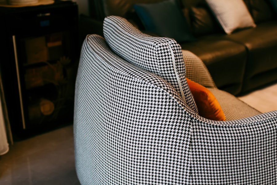
- Follow the pattern scale rule to avoid visual noise. Patterns can coexist in one room. They just need to be different in scale. A large floral on your sofa pairs well with a small geometric stripe on a chair and a solid on the ottoman. When two patterns are close in scale, like a medium floral next to a medium plaid, your eye can't decide where to rest and the room starts to feel restless. As a practical guideline: use no more than two patterned pieces per seating group, and make sure at least one solid or near-solid anchors the set. For spring, floral prints are everywhere right now, and they work beautifully as a statement piece when they're surrounded by solids and subtle textures.
- Place your boldest pattern on your smallest piece. This is a proportion rule that designers lean on constantly. A bold, busy print on a sofa can overwhelm a room. The same print on an accent chair or an ottoman? It reads as intentional and confident. Your largest pieces carry solid or low-contrast fabric, your medium pieces carry secondary textures or subtle patterns, and your smallest pieces, like ottomans, benches, and accent chairs, handle the statement prints. This distribution keeps the room from looking like it's shouting from every corner.
- Create color flow by repeating each color at least twice. A color that appears only once in a room looks like a mistake. A color that appears in two or three places looks like a decision. If your accent chair is in a dusty rose velvet, bring that same rose into a throw pillow on the sofa or a trim detail on a curtain panel. This doesn't mean everything has to match exactly. The rose can shift slightly in tone or texture across the room. Repetition is what makes a layered room feel designed rather than decorated by accident.
- Test your combinations in actual room light before committing. Spring light is different from winter light, and it's different from afternoon light versus morning light in the same room. Fabric samples that look cohesive on your phone screen can clash under the warm cast of your particular windows. Order swatches, hold them up together in your room, and look at them at different times of day. Pay special attention to how beige, cream, and white fabrics interact. Some read warm and golden, others read cool and slightly grey, and they will fight each other if you're not careful.
- Don't ignore the undersides and legs of your furniture. Visual weight lives in the legs and frames as much as the fabric. A heavy, dark wood frame paired with a light linen reads differently than the same linen over a slim metal base. When you're planning your fabric combinations, keep in mind the full visual profile of each piece. If all your frames are dark wood, lean toward lighter fabrics on at least two of the pieces to keep the room from feeling heavy. If you've got mixed metals and woods, use fabric as a unifying thread by repeating colors or textures across the different frame styles.
- Edit ruthlessly once everything is in place. Layering fabrics is additive by nature, which means it's easy to do too much. Once your pieces are arranged in the room, step back and look with fresh eyes. If something feels busy or disconnected, don't assume you need to buy more. You might need to remove something. A solid-colored slipcover on one piece, or even swapping a patterned throw for a plain one, can settle a room down instantly. The goal is a room that feels pulled together, not one that shows all the work you put into it.
What Are the Best Spring Upholstery Fabrics for Mixing and Layering?
Linen, performance velvet, and woven chenille are the strongest starting points for layering spring upholstery fabrics in a living room. Linen brings lightness and breathability that genuinely suits warmer months, with natural texture that pairs easily with almost anything. Performance velvet, which typically achieves 50,000 or more double rubs in solution-dyed versions, offers rich color depth and a smooth surface that contrasts beautifully against more casual textures like boucle or cotton. Chenille sits in a useful middle ground: its looped pile construction gives it softness and slight sheen without the formality of velvet, and it layers naturally with floral prints or stripes. For spring specifically, consider incorporating at least one fabric in a lighter botanical or earthy tone. Sage green, warm cream, and dusty blue are all having a strong moment this season and translate well across fabric types.
How Do You Know When Your Fabric Combinations Are Working?
A room's fabric layering is working when your eye moves around the space without getting stuck or confused. That's the simplest test. Stand in the doorway and scan the room. If there's a piece that immediately jumps out in a bad way, or one that seems to disappear entirely, something is off in either contrast or scale. Well-balanced rooms have a clear flow. You can trace a color or texture through multiple pieces like a visual rhythm. Each piece feels distinct but connected. If you squint and the room becomes a single blurry impression of related tones and textures rather than a collection of competing objects, you've landed it.
Tips and Troubleshooting
- Too many patterns: Pull one patterned piece and replace it with a solid in the dominant color from that pattern. Instant relief.
- Colors feel disconnected: Add a multi-colored throw pillow that contains all three of your room's key colors. It acts as a visual bridge.
- Room feels flat or boring: Add one tactile texture you don't have yet. A boucle pillow, a chenille ottoman, or even a faux leather accent stool can shift the whole energy.
- Everything matches too well: Yes, this is a real problem. If every piece is the same beige linen, the room will read as a furniture showroom. Introduce one piece with contrast, even slightly, to give the eye somewhere to rest.
- Fabric is fading unevenly: If pieces get different sun exposure, this matters a lot. Solution-dyed acrylic fabrics resist UV degradation significantly better than surface-printed fabrics because the color runs through the entire fiber rather than sitting on top of it. If your room gets heavy sun, prioritize solution-dyed or treated performance fabrics on the pieces closest to windows.
Frequently Asked Questions
Q: How many different upholstery fabrics can you use in one room without it looking chaotic?
Three to four distinct fabrics is a practical limit for most living rooms. Use one anchor fabric on your largest piece, two complementary fabrics on medium pieces, and one accent fabric on your smallest pieces. Beyond four, the room starts to lose visual cohesion unless you have a very strong unifying color story running through all of them.
Q: Can you mix velvet and linen upholstery in the same room?
Yes, and it's one of the best combinations for spring. Velvet and linen contrast beautifully in texture without competing in weight or formality. The key is to connect them through color. A sage velvet accent chair next to a natural linen sofa works because the neutral linen grounds the richer velvet rather than fighting it.
Q: What is double rub count and does it matter when layering fabrics?
Double rub count measures how many times a fabric can be rubbed back and forth before it shows visible wear. It matters when layering because pieces that receive similar use should have similar durability ratings so they age at the same rate. For main seating in a family room, aim for a minimum of 30,000 double rubs. Accent pieces with lower traffic can go lower, but going too far below that threshold on anything that gets daily contact will show within a year or two.