
You've found a fabric you love online. The color looks perfect, the texture looks right, and the price is solid. So you order a sample, it shows up in a little square, and now you're standing in your living room holding it up to your couch wondering if it actually matches anything in your house. Sound familiar? This guide is here to fix that. Using upholstery fabric samples correctly in your home's natural spring light is genuinely the best thing you can do before committing to a full reupholstery project, and it's not complicated once you know what you're looking for.
Why Spring Light Is Actually the Best Time to Test Fabric Swatches
Spring light is softer and more neutral than summer sun, which can wash out colors and bleach fabric tones in your photos and your perception. In the spring months, sunlight enters at a lower angle than it does in July, which means you get a longer window of balanced, true-color light throughout the day. For evaluating upholstery fabric swatches, this is ideal.
Here's the thing: fabric color shifts dramatically depending on the light source. A linen in "warm oat" can read almost white in bright midday spring light and pick up golden undertones by late afternoon. A blue velvet might look rich and deep at 10am but shift slightly grey by 3pm once the light changes direction. Testing your samples across different times of day, in the actual rooms where the furniture will live, gives you information no product photo can.
Spring is also when most people are refreshing their homes, which means your inspiration is fresh and your eye is calibrated to what you actually want. Take advantage of that energy.
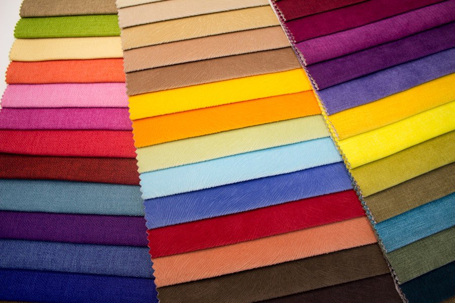
Photo by Ekaterina Grosheva on Unsplash
Step-by-Step Instructions
- Order multiple samples before you decide anything. Reputable fabric retailers, including famcorfabrics.com, offer samples for a reason. Order at least three to five options in the color family you're considering. If you're torn between a grey chenille and a cream boucle, get both. Fabric samples are inexpensive, and they will save you from a very expensive mistake. Don't try to decide from a single swatch.
- Place your swatches in the room where the furniture actually lives. This sounds obvious, but a lot of people evaluate samples in the kitchen or under a bathroom light. Bring every swatch into the specific room where the piece will be used. Put it on the sofa, on the armchair, on the cushion. Let it sit there for a minute. Your eye needs context to evaluate color and texture accurately.
- Test at three distinct times of day: morning, midday, and late afternoon. Morning light in spring tends to be cooler and slightly blue-toned. Midday light is the most neutral. Late afternoon light is warm and golden. A fabric that looks perfect at noon might feel orange-ish or yellow-heavy by 4pm. Check all three. If you're planning to use the piece in a room you primarily use in the evening, also check your samples under your artificial lighting, whether that's warm LED, cool overhead, or lamp light.
- Hold the swatch against your existing furniture, walls, and flooring. You're not just looking for a color you like in isolation. You're looking for a color that works with everything already in the room. Press the swatch against your sofa cushions, hold it next to the wall color, lay it on the rug. This is where a lot of people realize a "perfect" color online is actually fighting with their warm-toned hardwood or cool grey walls.
- Evaluate texture in direct and indirect light separately. Texture reads completely differently depending on light direction. A chenille or boucle fabric will show its pile and dimensional quality in raking side light, which is light coming in from a window at an angle. In flat overhead light, that same texture can look almost flat and dull. Velvet is particularly sensitive to this. Hold the swatch at different angles and watch how the pile catches or absorbs light. That shift is exactly what you'll see every day once the piece is reupholstered.
- Check for color consistency across the full swatch surface. Some fabrics, especially woven jacquards and designer prints, have a pattern repeat that may not be fully visible in a small sample. Look for any shading variation across the swatch. Solution-dyed acrylics, where the color is locked into the fiber during the manufacturing process rather than applied after, tend to show excellent color consistency and are among the most fade-resistant fabrics available. This matters especially for pieces near windows in spring and summer.
- Do a quick scratch and snag test with your fingernail. Run your fingernail lightly across the fabric surface. This gives you a basic sense of how the weave responds to friction. A tight, dense weave will hold its shape. A loose weave may catch or pull. For households with kids or pets, this matters. Fabrics rated above 30,000 double rubs on the Martindale abrasion test, which measures how many cycles of friction a fabric can withstand before showing wear, are considered heavy-duty for residential use.
- Test for pet and kid resistance if that's a factor. If you have a dog with claws or a child with markers, your fabric evaluation needs to go beyond color. Rub the swatch with a damp cloth to test basic moisture response. Microfiber, tightly woven cotton, and solution-dyed fabrics tend to clean up well. Velvet and loosely woven linens are trickier. Faux leather and vinyl are the most forgiving for spills and are worth including in your sample test even if they weren't your first instinct.
- Photograph the swatch in context and compare to your original inspiration images. Once you've tested in different light, take a photo of the swatch on the furniture in your room. Compare that photo to the product image and to whatever inspiration image made you want this fabric in the first place. Your eye adapts when you're standing in the room, but a photo shows you the objective comparison. If the photo looks great, that's a very good sign.
- Narrow to one or two finalists and sit with them for 48 hours. Once you've done all the testing, resist the urge to decide immediately. Leave your two best options in the room for a couple of days. Live with them. Notice which one you keep looking at versus which one you've stopped seeing. That instinct is usually right.
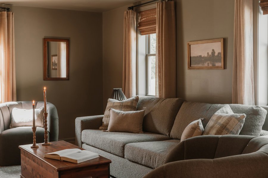
Photo by Clay Banks on Unsplash
What Does "Color Accuracy" Actually Mean for Upholstery Fabric?
Color accuracy in upholstery fabric refers to how closely a fabric's real-world appearance matches what you see in a product photo, and how consistently that color holds up over time and across different lighting conditions. It's one of the most common sources of disappointment in fabric purchases, and it's almost always a lighting problem, not a quality problem.
Monitor calibration, photography lighting, and image compression all change how a fabric looks on your screen. Blues pick up extra saturation in product photography. Creams and whites can look stark or warm depending on the studio light used. This is not the retailer trying to mislead you. It's just the nature of digital color. Ordering a physical sample is the only reliable solution.
Honestly, this is where spring works in your favor. The balanced, neutral quality of spring daylight is closer to "true color" than most artificial lighting, which means your samples will read more accurately now than they would under fluorescent office lighting or a warm-toned 2700K lamp. Use that to your advantage.
Which Fabric Types Show the Biggest Difference Between Screen and Real Life?
Velvet, chenille, and boucle are the fabric types most likely to look different in person compared to a product photo. These are pile fabrics, meaning their surface is made up of raised loops or cut fibers that catch and reflect light in a directional way. A product photo captures the fabric at one specific angle and in one specific light. In your home, the fabric will look slightly different every time the light changes.
Velvet gets a bad rap for being high-maintenance, but a lot of that reputation is outdated. Modern performance velvets, especially those with a solution-dyed or stain-resistant finish, are genuinely practical for everyday use. They also happen to look incredible in spring afternoon light, which brings out the depth and richness of the pile in a way that no screen can replicate.
Jacquard and woven fabrics with a pattern repeat are also worth sampling carefully, because the scale of the pattern affects the whole look of a piece. A repeat that looks subtle on a small swatch might feel bold and dominant once it's covering an entire sofa cushion. When in doubt, ask the retailer for the pattern repeat measurement before ordering.
Flat fabrics like linen, cotton, and faux leather tend to translate more accurately from screen to room, which makes them lower-risk for color surprises. Linen in particular photographs close to its real-world appearance, though it can look slightly more yellow or warm in person than on a cool-calibrated monitor.
Quick Tips for Getting the Most Out of Your Fabric Samples
- Label the back of each swatch with the fabric name and colorway so you don't mix them up after a day or two of testing.
- If you're reupholstering multiple pieces in the same room, test all the fabric combinations together at the same time, not separately.
- Don't evaluate swatches on a white background. White distorts how colors read. Put them on a neutral grey or beige surface.
- If you're choosing between two very similar colors, the slightly lighter one almost always looks more intentional in a finished room. Upholstered pieces read darker once they're fully assembled and sitting against walls.
- Keep your finalists somewhere safe. If you end up going back to reconsider weeks later, you'll want them still in good condition.
Frequently Asked Questions
Q: How many fabric samples should I order before choosing an upholstery fabric?Order at least three to five samples in your target color family. Testing multiple options side by side in your actual room gives you a much more accurate read on color and texture than evaluating a single sample in isolation. Samples are low-cost and prevent expensive ordering mistakes.
Q: What is a double rub count and why does it matter for upholstery fabric?A double rub count measures how many cycles of back-and-forth friction a fabric can withstand before showing visible wear. It comes from the Martindale or Wyzenbeek abrasion test. For everyday residential use, look for fabrics rated at 15,000 double rubs or higher. For households with kids or pets, 30,000 or above is a more practical minimum.
Q: Why does my upholstery fabric look different in my home than it did in the product photo?Fabric color is highly sensitive to light source, monitor calibration, and photography conditions. A fabric photographed under studio lighting will look different under warm home lamps, cool daylight, or overhead LED. Ordering a physical sample and testing it in your own space at different times of day is the only reliable way to confirm how a fabric will actually look in your home.